• How to Choose the Right Color Palette for Your Website?

    Color is one of the most powerful design elements in web design. It influences how users feel, interact, and remember your brand. A well-chosen color palette not only enhances your website’s aesthetic appeal but also strengthens brand identity, guides user behavior, and improves overall usability.

    Choosing the right colors isn’t just about personal preference, it’s a strategic decision that impacts user experience and conversion rates. In this blog, we’ll explore how to choose the perfect color palette for your website, the psychology behind colors, and best practices to ensure your design captures attention and communicates your message effectively.

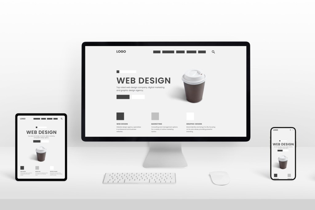
    1.     Understand the Importance of Color in Web Design

    Before diving into how to select your website colors, it’s essential to understand why color matters so much.

    Colors can evoke emotions, create moods, and influence decision-making. For example, blue is often associated with trust and professionalism (used by brands like PayPal or LinkedIn), while red signifies excitement, passion, or urgency (used by YouTube and Coca-Cola).

    A carefully planned color scheme helps:

    • Establish your brand identity and make it memorable.
    • Create a visual hierarchy, guiding users’ attention to key elements.
    • Enhance readability and improve the overall user experience.
    • Build emotional connections with your audience.

    The wrong color combinations, on the other hand, can make your site look unprofessional, cause eye strain, or even drive users away. Experienced web designers in London can help you craft the perfect color palette that enhances your brand identity and website performance.

    2.     Know Your Brand Identity and Audience

    Your color palette should reflect your brand’s personality and appeal to your target audience. Start by identifying your brand’s core traits, is it youthful and energetic, calm and professional, or elegant and luxurious?

    For instance:

    • Bright colors like yellow and orange convey energy, friendliness, and creativity.
    • Cool tones like blue and green represent trust, peace, and reliability.
    • Neutral colors like black, white, and gray give a sophisticated, minimalist feel.

    Next, consider your audience demographics. A website for a children’s toy brand will use playful, vibrant colors, while a financial consulting firm will lean toward more conservative tones like blue, gray, or navy. Understanding both your brand and audience ensures your color choices align with expectations and enhance your brand message.

    3.     Learn the Basics of Color Psychology

    Color psychology studies how different hues affect human emotions and perceptions. Here’s a quick breakdown of what some common colors symbolize:

    • Red: Passion, excitement, urgency, or danger. Often used in call-to-action buttons.
    • Blue: Trust, professionalism, and calmness. Commonly used by corporate and tech brands.
    • Green: Growth, health, and balance. Ideal for eco-friendly or wellness brands.
    • Yellow: Optimism, energy, and warmth. Great for attention-grabbing designs.
    • Orange: Creativity, enthusiasm, and friendliness. Often used in youthful brands.
    • Purple: Luxury, creativity, and spirituality. Popular with beauty and premium brands.
    • Black: Elegance, power, and sophistication. Common in high-end fashion or design.
    • White: Simplicity, purity, and cleanliness. Often used in modern, minimal designs.

    Using color psychology strategically allows you to set the right tone for your website and evoke the desired emotional response from users.

    4.     Follow the 60-30-10 Rule for Balance

    One of the most effective color balance techniques in web design is the 60-30-10 rule. It ensures visual harmony by distributing colors across your site in the following proportions:

    • 60% Primary Color: The dominant color used across your website background and large sections.
    • 30% Secondary Color: Used for supporting elements such as sidebars, graphics, or illustrations.
    • 10% Accent Color: Applied sparingly for highlights, call-to-action buttons, or icons.

    For example, a website might use navy blue (60%) as the primary color, white (30%) as the secondary color, and a bright orange (10%) as an accent to draw attention to CTAs. This rule keeps your design visually appealing without overwhelming the viewer.

    5.     Use Color Contrast to Improve Readability and Focus

    Color contrast plays a crucial role in readability and accessibility. Without proper contrast, text and visual elements can blend into the background, making content hard to read.

    Here are a few tips for maintaining contrast:

    • Ensure text and background colors have sufficient contrast (e.g., dark text on a light background).
    • Use tools like the WebAIM Contrast Checker to test accessibility compliance.
    • Highlight important elements such as buttons or links with contrasting accent colors to make them stand out.

    Proper contrast not only enhances readability but also ensures your site is accessible to users with visual impairments or color blindness.

    6.     Create Harmony with Color Schemes

    Color harmony ensures that all colors in your palette work well together. Designers often use the color wheel to find harmonious combinations based on different color relationships:

    • Monochromatic: Variations of a single hue (great for minimalist designs).
    • Analogous: Colors next to each other on the wheel (e.g., blue, teal, and green) for a calm, cohesive look.
    • Complementary: Colors opposite each other (e.g., blue and orange) for high contrast and energy.
    • Triadic: Three colors evenly spaced (e.g., red, yellow, and blue) for a balanced yet vibrant palette.
    • Split-complementary: A mix of one base color and two complementary tones for a dynamic but less intense effect.

    Experiment with these combinations to find one that suits your brand’s tone and visual identity.

    7.     Take Inspiration from Successful Brands

    Sometimes, looking at established brands can inspire your own color strategy. For example:

    • Spotify uses black, white, and green for a modern, tech-driven look.
    • Airbnb uses coral and white to evoke warmth and friendliness.
    • Apple keeps things minimal with black, white, and gray to reflect sophistication.

    These brands demonstrate how a consistent and well-thought-out color palette can reinforce brand identity and enhance user perception.

    8.     Test and Refine Your Color Choices

    Once you’ve chosen your colors, it’s important to test them in real-world scenarios. Sometimes colors that look great on a mood board may not perform well on-screen. A/B test different combinations for call-to-action buttons, backgrounds, or headlines to see which colors drive the most engagement.

    Also, check your palette on multiple devices (desktop, tablet, and mobile) to ensure consistency and legibility. Remember, color perception can vary across screens, so testing ensures your site looks polished and professional everywhere.

    9.     Use Design Tools to Simplify the Process

    Thankfully, several online tools can help you create and refine your color palette with ease:

    • Coolors.co: Generates beautiful color palettes instantly.
    • Adobe Color Wheel: Lets you explore color harmonies and create custom palettes.
    • Paletton: Ideal for experimenting with complementary and triadic schemes.
    • Canva Color Palette Generator: Extracts colors from images to create brand-inspired palettes.

    These tools make the process quicker and ensure your chosen colors align perfectly with your brand’s vision.

    10.Maintain Consistency Across All Brand Assets

    Once you finalize your website color palette, use it consistently across all your marketing materials, from social media and brochures to email newsletters. This builds recognition and trust, making your brand instantly recognizable. Consistency reinforces your identity and ensures every user interaction aligns with your website’s visual tone and message. By working with expert web designers in London, you can ensure your site’s colors are strategically chosen to captivate users and improve conversions.

    Conclusion

    Choosing the right color palette for your website is both an art and a science. It requires a balance of creativity, psychology, and strategy. The right colors can elevate your design, communicate your brand’s message, and create an engaging experience that resonates with your audience. By understanding color psychology, using balanced schemes, and maintaining consistency, you can design a website that’s not only visually stunning but also deeply effective in driving user engagement and brand loyalty.

  • Why Security Should Be a Key Consideration in Web Design?

    In today’s digital landscape, websites have become the backbone of businesses, organizations, and even personal brands. They serve as platforms for communication, commerce, and customer engagement. However, as web technology evolves, so do cyber threats. From data breaches to malware attacks, security vulnerabilities can destroy user trust and tarnish a company’s reputation overnight.

    That’s why security should be a key consideration in web design, not an afterthought. Building a visually appealing and functional website is essential, but without strong security measures, even the most beautiful design can quickly become a liability.

    This blog explores why website security must be integrated into the design process, common security risks, and the best practices for creating a safe, user-trusted digital environment.

    1.     The Growing Importance of Website Security

    Web security is no longer optional; it’s a necessity. Every website, regardless of its size or purpose, is a potential target for hackers. In fact, studies show that over 30,000 websites are hacked daily worldwide. While large corporations often make headlines for data breaches, small businesses are just as vulnerable, if not more so, because they typically lack robust security frameworks.

    Security breaches can have devastating consequences: loss of customer data, legal penalties, downtime, and irreparable damage to brand reputation. When users feel unsafe browsing or sharing information on your site, they’re unlikely to return. Thus, prioritizing security during the web design phase ensures long-term protection and builds lasting trust with visitors.

    2.     Why Security Starts with Web Design

    Most people associate security with firewalls, SSL certificates, or antivirus tools added after launch. However, true website security begins at the design and development stage. The foundation of a secure website is built through thoughtful architecture, coding standards, and user experience planning.

    Integrating security from the beginning has multiple advantages:

    • Early Risk Mitigation: Identifying vulnerabilities before launch prevents costly redesigns later.
    • Stronger Infrastructure: Secure design decisions, such as data encryption, validation, and authentication form the base of a resilient site.
    • User Confidence: A secure design reassures users that their data is protected, enhancing credibility and engagement.

    By designing with security in mind, developers and designers can create not just an attractive interface but a trustworthy, dependable platform. Experienced web designers in London focus on creating secure, user-friendly websites that protect data while delivering exceptional digital experiences.

    3.     Common Website Security Threats

    Before exploring how to design for security, it’s important to understand the common risks modern websites face.

    a) Malware and Ransomware Attacks

    Hackers inject malicious code or ransomware into websites to steal data, disrupt operations, or demand payment. Such attacks can damage your reputation and lead to data loss.

    b) SQL Injections

    This occurs when attackers exploit input fields (like forms or search bars) to manipulate databases and access sensitive information.

    c) Cross-Site Scripting (XSS)

    XSS attacks involve injecting malicious scripts into a website that can steal cookies or user data when a visitor interacts with the compromised page.

    d) Phishing and Fake Login Pages

    Cybercriminals may clone your website’s design to trick users into revealing credentials or payment details, harming your brand’s credibility.

    e) DDoS Attacks (Distributed Denial of Service)

    These attacks flood a website with excessive traffic, causing it to crash and become inaccessible to legitimate users.

    f) Weak Authentication

    Poor password management or lack of two-factor authentication makes it easier for hackers to gain unauthorized access.

    Understanding these threats helps web designers and developers take preventive action through strong design and coding practices.

    4.     Key Security Practices in Web Design

    To create a secure and reliable website, web designers and developers must incorporate multiple layers of protection from the start. Here are the most critical areas to focus on:

    a) Use HTTPS and SSL Certificates

    A secure connection (HTTPS) ensures data transferred between the website and users remains encrypted. It protects sensitive information such as login details and payment data. Besides security, HTTPS is now a ranking factor in Google’s SEO algorithm, making it vital for both protection and visibility.

    b) Secure Coding Practices

    Clean, validated, and up-to-date code minimizes vulnerabilities. Designers and developers should:

    • Validate user input to prevent SQL injections.
    • Avoid using outdated libraries or plugins.
    • Regularly scan for and patch vulnerabilities.

    c) Data Encryption and Privacy Protection

    Websites that handle personal data, such as e-commerce platforms or membership sites — must encrypt stored information. Encryption ensures that even if data is intercepted, it remains unreadable to unauthorized parties.

    d) Strong Authentication Systems

    Implementing multi-factor authentication (MFA) and strong password policies protects both website admins and users. Login pages should include safeguards like CAPTCHA and limited login attempts to prevent brute-force attacks.

    e) Regular Updates and Maintenance

    Outdated software, themes, and plugins are among the most common entry points for hackers. Web designers must create maintenance-friendly designs that allow easy updates without breaking the site’s structure.

    f) Role-Based Access Control

    Not everyone needs full access to a website’s backend. Restrict administrative privileges to essential personnel only. This minimizes the risk of accidental or malicious changes.

    g) Secure Hosting and Backups

    Choosing a reputable hosting provider with built-in security measures (like firewalls and malware scanning) adds an extra layer of defense. Additionally, automated backups ensure your website can be quickly restored after an attack.

    h) Safe File Uploads

    If your website allows users to upload files, ensure those uploads are restricted, scanned, and validated to prevent the introduction of malicious scripts.

    5.     Designing for Trust and Transparency

    Security in web design is not just technical, it’s also psychological. Users should feel safe when browsing your website. A few design elements can help foster that trust:

    • Display trust seals or SSL badges prominently.
    • Use clear and transparent privacy policies.
    • Create intuitive navigation and secure checkout processes.
    • Avoid unnecessary pop-ups or redirect links that could appear suspicious.

    By prioritizing transparency and safety cues, web designers can turn security into a trust-building tool rather than a background feature.

    6.     Balancing Aesthetics and Security

    A common misconception is that adding strong security measures compromises design flexibility or aesthetics. In reality, secure design enhances the overall user experience. Modern web design tools and frameworks allow developers to combine sleek visuals with robust security without sacrificing usability.

    A secure design might include:

    • Seamless login systems with encrypted credentials.
    • User-friendly verification processes (like biometric or OTP authentication).
    • Secure payment gateways integrated into clean, minimalist layouts.

    When aesthetics and security work together, the result is a site that is both visually appealing and functionally dependable.

    7.     The Long-Term Benefits of Secure Web Design

    Investing in security during the web design phase pays off in several ways:

    • Reduced Risk: Fewer vulnerabilities mean fewer disruptions and lower recovery costs.
    • Customer Loyalty: Users who feel safe are more likely to return and recommend your website.
    • Better SEO Performance: Google rewards secure, HTTPS-enabled sites with higher rankings.
    • Regulatory Compliance: Security measures help meet data protection laws such as GDPR.
    • Business Credibility: A secure website reflects professionalism and reliability.

    Ultimately, security adds value not only to your website but to your entire brand. By partnering with professional web designers in London, businesses can ensure their websites combine cutting-edge design with robust security features for long-term success.

    Conclusion

    Website design is about more than aesthetics; it’s about building safe, seamless, and trustworthy online experiences. With cyber threats on the rise, security must be a key consideration in web design, not a post-launch add-on. From encrypted connections and secure coding to authentication systems and user trust signals, every element should contribute to safeguarding data and ensuring a positive user experience. A well-designed, secure website not only protects users but also strengthens your brand’s reputation in an increasingly competitive digital world. The future of web design belongs to those who can balance creativity with cybersecurity, delivering designs that are as safe as they are stunning.

  • How to Incorporate Augmented Reality (AR) in Modern Web Design?

    In the digital era, where user engagement and interactivity define online success, Augmented Reality (AR) has emerged as a groundbreaking tool for web designers. Once considered futuristic, AR is now shaping the way users interact with websites, creating immersive experiences that bridge the gap between the physical and digital worlds. Integrating AR into modern web design can transform how visitors perceive products, services, and brands, offering them a unique, memorable, and interactive experience.

    This blog explores how you can incorporate AR into web design, its benefits, and the best practices for creating an engaging augmented reality experience online.

    1.   Understanding Augmented Reality in Web Design

    Augmented Reality (AR) overlays digital elements, such as 3D models, animations, or information, onto the real world through devices like smartphones, tablets, or AR glasses. When integrated into web design, AR allows users to interact with these virtual elements directly through a browser, without needing an app or special software.

    For example, furniture websites now let users visualize how a sofa would look in their living room using AR. Similarly, fashion retailers enable customers to virtually try on clothes or accessories before purchasing. This interactive layer enhances engagement, builds trust, and significantly boosts conversion rates. Skilled web designers in London can help you create innovative, user-focused websites that seamlessly integrate technologies like AR for enhanced engagement.

    2.   Why AR Is Transforming Modern Web Design

    Modern web design is no longer just about aesthetics; it’s about creating experiences. AR allows brands to offer something traditional design cannot, interaction that feels real.

    Here is key reasons AR is becoming central to modern web design:

    • Enhanced User Engagement: AR invites users to explore and interact rather than passively view. This hands-on experience keeps visitors on the site longer.
    • Improved Decision-Making: By visualizing products in real environments, customers can make more confident purchase decisions.
    • Brand Differentiation: As AR is still an emerging trend, adopting it early positions your brand as innovative and forward-thinking.
    • Better Conversion Rates: The combination of visual engagement and real-world context leads to higher customer satisfaction and sales.

    3.   Types of AR Applications in Web Design

    There are several creative ways to integrate AR into your website design, depending on your goals and audience.

    a)     Product Visualization

    One of the most popular uses of AR is product visualization. For e-commerce websites, this feature allows customers to view a product in their own environment. For example, IKEA’s AR tool lets users place virtual furniture in their homes to check scale, color, and style before buying.

    b)    Virtual Try-Ons

    Fashion and beauty brands use AR to let customers virtually try on clothes, glasses, or makeup. This not only enhances the shopping experience but also reduces return rates by helping users make better choices.

    c)     Interactive Learning Experiences

    Educational platforms and museums use AR to make learning interactive. Websites can embed AR objects that users can manipulate in real time, making complex subjects easier to understand.

    d)    3D Product Demos

    Businesses offering tech or machinery can include AR-based 3D demonstrations, helping customers understand how a product works before investing in it.

    e)     Location-Based AR

    Websites for travel, tourism, or real estate can integrate AR maps and location guides, enabling users to explore destinations virtually.

    4.   How to Integrate AR into Your Website

    Implementing AR into web design requires the right tools, planning, and creativity. Here are practical steps to get started:

    a)     Identify the Purpose

    Start by defining why you want to add AR. Is it to improve sales, engagement, education, or entertainment? Having a clear goal will help you choose the right type of AR experience and design approach.

    b)    Choose the Right AR Framework

    Modern web technologies make it possible to integrate AR without requiring users to download an app. Some popular frameworks include:

    • AR.js – Lightweight and works well across mobile browsers.
    • Three.js – Perfect for adding 3D graphics to your AR experiences.
    • 8th Wall – A commercial platform offering advanced web-based AR tools.
    • A-Frame – Built on top of HTML, making it easy to use for web designers.

    These frameworks allow you to create immersive experiences directly accessible through browsers like Chrome, Safari, and Firefox.

    c)     Optimize for Mobile Devices

    Most users access AR content through smartphones. Ensure that your AR elements are mobile-friendly, meaning they load fast, are easy to interact with, and do not require additional app installations.

    d)    Keep Performance in Mind

    AR elements, especially 3D models, can slow down website performance if not optimized. Compress images and 3D files, and use lazy loading to maintain fast page speeds.

    e)     Focus on User Experience (UX)

    AR should enhance, not complicate, the user journey. Keep navigation intuitive, use clear instructions, and avoid cluttering the interface. Make sure users can easily toggle between AR mode and standard browsing.

    5. Best Practices for AR-Enhanced Web Design

    To make your AR integration truly effective, follow these design and usability tips:

    • Simplify Interactions: Make AR features easy to use, even for first-time visitors.
    • Prioritize Accessibility: Ensure users with different devices and internet speeds can still access your website.
    • Provide Clear Instructions: Guide users on how to activate and use AR features.
    • Ensure Cross-Browser Compatibility: Test your AR elements on different browsers and operating systems.
    • Balance Design and Functionality: Don’t let AR overshadow usability, it should complement the website’s purpose.

    5.   Benefits of Incorporating AR into Your Website

    Adding AR to your website doesn’t just enhance visual appeal, it drives measurable business results.

    • Higher Engagement Rates: Users spend more time exploring and interacting with your site.
    • Improved Conversion Rates: AR experiences give customers confidence in their purchases.
    • Reduced Return Rates: Especially in e-commerce, virtual try-ons and product visualization reduce post-purchase dissatisfaction.
    • Enhanced Brand Image: AR shows innovation and creativity, helping you stand out from competitors.
    • Better Data Insights: AR tools can track user behavior and preferences, providing valuable insights for marketing strategies.

    6.   Real-World Examples of AR in Web Design

    • IKEA Place: Allows users to see how furniture fits into their space before buying.
    • Warby Parker: Lets customers virtually try on glasses using their phone’s camera.
    • Nike: Offers AR shoe fittings that suggest the perfect size based on foot dimensions.
    • Sephora: Provides virtual makeup trials directly through its website.

    These brands show how AR can transform online shopping from a static experience into an engaging, interactive one

    8. The Future of AR in Web Design

    As AR technology continues to evolve, it’s expected to become a standard part of modern web design. With advancements like WebXR (a standard for VR and AR on the web), designers will soon be able to build immersive experiences that are accessible to everyone, regardless of device or platform.

    Future websites may allow users to virtually walk through a store, explore products in 3D, or even attend live virtual events, all from a browser. The possibilities are endless, and forward-thinking designers who embrace AR now will be at the forefront of this digital transformation. Partnering with expert web designers in London ensures your site stands out with modern design trends and delivers an exceptional user experience.

    Conclusion

    Incorporating Augmented Reality (AR) into modern web design is more than just a trend, it’s a shift toward more engaging, interactive, and personalized digital experiences. Whether used for product visualization, education, or entertainment, AR offers endless opportunities to captivate users and enhance brand perception. As technology becomes more accessible, even small and medium businesses can leverage AR to deliver memorable experiences that go beyond traditional web design. The future of web design lies in immersion, and AR is the tool leading the way.

  • What Makes a Website Design Truly User-Centered?

    In today’s digital landscape, a website isn’t just an online brochure, it’s the core of your brand identity, customer experience, and business growth. However, even the most visually stunning websites can fail if they don’t put users first. That’s where user-centered design (UCD) comes in. A truly user-centered website is built around the needs, behaviors, and expectations of its visitors, ensuring they find what they’re looking for quickly and effortlessly.

    But what exactly makes a website design user-centered? Let’s explore the key principles, features, and practices that transform an ordinary website into one that’s intuitive, engaging, and user-focused.

    1.     Understanding User Needs and Behavior

    At the heart of user-centered design lies a deep understanding of your audience. Before creating a single layout or wireframe, it’s crucial to know who your users are and what they expect from your website. Start by conducting user research, this could include surveys, interviews, heatmaps, and analytics reviews. Learn about your users’ goals, pain points, and browsing habits.

    For example, an e-commerce shopper wants a fast checkout process, while a B2B client might prioritize detailed service information and case studies. When you design with real data instead of assumptions, you can create experiences that resonate. The goal is simple: make it easy for users to accomplish what they came for, without confusion or unnecessary steps.

    2.     Simple and Intuitive Navigation

    Navigation is one of the most critical aspects of a user-centered website. Visitors should never struggle to find what they need. If users have to think too hard about where to click next, you risk losing them to frustration and eventually, to competitors.

    A user-friendly navigation system should be:

    • Clear and consistent: Use straightforward labels like Home, Services, About, and Contact.
    • Predictable: Place menus where users expect to find them, usually at the top or side of the page.
    • Concise: Avoid overloading menus with too many options. Group related pages under logical categories.
    • Searchable: Include a visible search bar for quick access to information.

    Good navigation allows users to move through your website smoothly, improving both user satisfaction and engagement. Skilled professional web designers focus on creating user-centered websites that deliver seamless experiences across all devices.

    3.     Mobile Responsiveness and Accessibility

    In an era where more than half of web traffic comes from mobile devices, designing for all screen sizes is non-negotiable. A responsive website design automatically adapts to different devices—whether it’s a smartphone, tablet, or desktop, without compromising functionality or aesthetics.

    Beyond responsiveness, accessibility is another vital part of a user-centered approach. Your website should be usable by everyone, including individuals with disabilities. This means following Web Content Accessibility Guidelines (WCAG), such as:

    • Using readable font sizes and high-contrast colors.
    • Adding alt text to images for screen readers.
    • Ensuring buttons and links are easy to tap or click.
    • Avoiding auto-play elements that disrupt the user experience.

    A truly user-centered website is one that welcomes every visitor, regardless of their device or ability.

    4.     Fast Loading Speed

    Nothing drives users away faster than a slow website. In fact, studies show that if a page takes more than three seconds to load, more than half of users will abandon it. Speed directly impacts both user experience and SEO rankings, making it a critical component of user-centered design.

    To improve your website’s loading speed:

    • Compress large image files without losing quality.
    • Use caching and a reliable hosting provider.
    • Minimize the use of unnecessary scripts or plugins.
    • Implement lazy loading for media-heavy pages.

    A fast, seamless experience shows users that you respect their time—a key principle of good design.

    5.     Visual Hierarchy and Readability

    A visually appealing website isn’t just about color and graphics—it’s about structure. Visual hierarchy refers to the arrangement of elements in a way that naturally guides users’ attention to what matters most. Use size, contrast, and spacing to highlight important information such as headlines, calls to action (CTAs), and key services.

    For example, a bold headline and a brightly colored CTA button can draw the eye toward your desired action, whether that’s filling out a form or making a purchase. Readability also plays a major role. Break up text into short paragraphs, use bullet points for clarity, and maintain plenty of white space. When content is easy to read, users stay longer and absorb more information, two strong signals of a positive user experience.

    6.     Engaging and Relevant Content

    Design and content go hand in hand. A visually stunning layout means little if the content isn’t valuable to your audience. A user-centered website provides content that educates, engages, and solves problems.

    Ask yourself: does your content answer the questions your users are asking? Is it written in a tone that matches your audience’s preferences?

    Here’s how to create user-focused content:

    • Write clear, concise, and actionable copy.
    • Include visuals, such as infographics or videos to simplify complex information.
    • Update outdated articles and remove irrelevant content.
    • Ensure that every page has a clear purpose and adds value.

    When visitors find helpful, relevant content, they are more likely to trust your brand and return in the future.

    7.     Strong Calls to Action (CTAs)

    A user-centered design guides visitors toward meaningful actions, whether it’s signing up for a newsletter, booking a consultation, or purchasing a product. This is where calls to action play a crucial role.

    Effective CTAs should be:

    • Visible: Place them where users naturally look, such as above the fold or at the end of a section.
    • Compelling: Use action-oriented phrases like “Get Started,” “Request a Quote,” or “Join Now.”
    • Consistent: Maintain design elements, like button colors and font styles throughout the website.

    When designed well, CTAs create a seamless path for users to follow, helping them move from interest to conversion without hesitation.

    8.     Continuous Testing and Improvement

    User-centered design doesn’t end once your website goes live, it’s an ongoing process. Continuous testing ensures your website evolves with changing user expectations and behaviors. Conduct regular A/B tests to compare different layouts, headlines, or button designs. Analyze data from Google Analytics to track user flow, bounce rates, and conversion metrics.

    Encourage user feedback through surveys or chat support to identify pain points and improvement areas. By continuously refining your design based on real user data, you can maintain a website that remains effective, relevant, and enjoyable to use. By collaborating with professional web designers, businesses can ensure their website not only looks great but also prioritizes user needs for maximum engagement.

    9.     Building Trust Through Design

    A truly user-centered website builds trust through consistency, transparency, and professionalism. Elements like a clear privacy policy, visible contact information, testimonials, and secure HTTPS connections all contribute to a trustworthy online presence.

    Small details, like clean layouts, quality visuals, and honest messaging, signal credibility to visitors. When users feel confident in your website, they’re more likely to engage with your brand and convert into loyal customers.

    Conclusion

    User-centered website design is about more than aesthetics, it’s about empathy, functionality, and purpose. It means stepping into your users’ shoes and designing experiences that meet their needs effortlessly. From intuitive navigation and fast load times to accessible design and meaningful content, every decision should enhance usability and satisfaction. When users enjoy interacting with your website, they stay longer, engage more deeply, and are more likely to take action. That’s the true measure of a successful, user-centered design. If you’re looking to create a website that connects with your audience and drives measurable results, working with professional web designers can help you bring your vision to life through thoughtful, user-focused strategies.

  • Why Should Corporate Brands Invest in Modern Web Design?

    In today’s digital-first world, a company’s website is often its first and most powerful impression. For corporate brands, a website isn’t just a digital brochure, it’s the cornerstone of credibility, communication, and customer engagement. Yet, many businesses still underestimate the power of modern web design in shaping their brand’s image and influencing business growth.

    A sleek, intuitive, and strategically designed website can set a corporate brand apart from competitors, improve trust among clients, and enhance the overall user experience. Let’s explore why investing in modern web design is no longer optional but essential for corporate success.

    1.     First Impressions Define Brand Credibility

    Your website is your digital handshake; it tells visitors who you are before they even read a word. Research shows that users form an opinion about a website within seconds, and 94% of those impressions are design-related.

    Outdated layouts, cluttered pages, or slow-loading graphics can instantly make your business appear unprofessional or unreliable. On the other hand, a clean, visually appealing, and mobile-responsive website communicates credibility and competence. Modern web design emphasizes visual hierarchy, responsive grids, and consistent branding, ensuring that the first impression reflects your company’s professionalism and attention to detail.

    2.     Modern Design Enhances User Experience (UX)

    User experience is at the heart of every modern web design strategy. Corporate brands must remember that their websites serve a wide range of audiences, clients, partners, investors, and potential employees. A well-designed website focuses on ease of navigation, readability, and interactivity.

    Modern design elements such as intuitive menus, minimal clutter, and clearly defined calls-to-action guide users seamlessly from one section to another. Additionally, responsive web design ensures your site adapts perfectly across all devices, desktop, tablet, and mobile. With mobile traffic now accounting for over half of all web visits, a non-responsive website can drive potential clients away. To stay ahead in the digital race, partnering with professional web designers can help you build a website that’s visually stunning, fast, and future-ready.

    3.     A Modern Website Strengthens Brand Identity

    Your website is a direct reflection of your corporate identity. Every color, font, image, and layout choice communicates something about your brand’s personality and values.

    A modern design allows brands to maintain consistency in visual elements and messaging tone, which strengthens brand recall. For example, a technology company might use futuristic typography and bold graphics, while a financial firm might opt for a minimalist design that conveys trust and stability. By aligning your web design with your brand’s mission and tone, you create a cohesive identity that resonates with your audience across all touchpoints, online and offline.

    4.     Improved SEO Performance

    Modern web design isn’t just about aesthetics; it also plays a critical role in search engine optimization (SEO). Search engines like Google reward websites that are technically optimized, fast, and user-friendly. A contemporary design ensures your site includes essential SEO elements like clean code, structured data, optimized images, and mobile responsiveness.

    Moreover, fast-loading pages improve user satisfaction and reduce bounce rates, two major factors in Google’s ranking algorithm. Incorporating SEO best practices during the design phase—such as using keyword-rich headings, logical site structure, and optimized meta tags, helps your corporate website rank higher and attract more organic traffic.

    5.     Increased Conversion Rates and Lead Generation

    A modern, strategically designed website is a powerful conversion tool. It doesn’t just attract visitors; it turns them into customers or leads. Elements such as clear CTAs, compelling visuals, and trust signals (like testimonials, case studies, and certifications) encourage users to take the next step.

    Whether that means filling out a contact form, scheduling a consultation, or requesting a quote, every design element should support conversion goals. Modern web design also uses behavioral insights and analytics to identify where users drop off or engage most, allowing continuous optimization for higher conversions.

    6.     Compatibility with Emerging Technologies

    Technology evolves rapidly, and so do user expectations. Modern web design embraces new technologies that enhance interactivity and functionality.

    For instance:

    • Chatbots can offer instant customer support.
    • AI-driven personalization tailors content to individual visitors.
    • Voice search optimization ensures users can find you through smart assistants.
    • Interactive videos and animations can simplify complex corporate information.

    By adopting these technologies, corporate websites not only stay current but also deliver engaging experiences that position them as forward-thinking industry leaders.

    7.     Better Data Security and Compliance

    Cybersecurity is a major concern for corporate brands. An outdated website built on old frameworks or plugins can expose vulnerabilities, putting sensitive business and client data at risk. Modern web design prioritizes security features, including SSL certificates, secure hosting, and compliance with data privacy laws like GDPR.

    Regular updates and security audits ensure your corporate site remains protected against cyber threats. In addition to safety, these measures build trust with users, showing that you value their privacy and data integrity.

    8.     Staying Competitive in a Digital Marketplace

    Competition in the digital space is fierce. Corporate brands that fail to adapt risk falling behind. A modern website design helps businesses stay competitive by aligning with current design trends, technologies, and customer expectations. When potential clients compare multiple companies, they’re naturally drawn to those with professional, well-designed websites.

     In fact, many users admit they judge a company’s credibility based solely on its website design. By continuously investing in web design improvements, such as integrating new features, updating visuals, and enhancing functionality, you ensure your brand remains relevant and attractive in a fast-changing marketplace.

    9.     Easier Content Management and Scalability

    Corporate websites often need to handle large volumes of content—blogs, press releases, case studies, and service updates. Modern web design built on content management systems (CMS) like WordPress or HubSpot makes it easy for teams to update, edit, and publish content without technical skills.

    Scalability is another benefit. As your business grows, your website can expand seamlessly with new pages, integrations, or functionalities, without requiring a complete redesign. This adaptability saves both time and long-term costs.

    10.Building Trust and Long-Term Relationships

    Trust is the foundation of every successful corporate brand. A modern website communicates transparency, reliability, and innovation, all of which influence how clients perceive your business.

    Features like professional imagery, consistent branding, customer testimonials, and transparent communication channels all help nurture confidence. When users feel they can trust your online presence, they’re far more likely to engage with your services and stay loyal to your brand. With the right professional web designers, your corporate brand can create an online experience that turns visitors into long-term clients.

    Conclusion

    A corporate website is more than a digital asset, it’s the face of your brand, the voice of your business, and a powerful driver of growth. Investing in modern web design ensures that your brand stands out in a competitive market, meets the expectations of a digitally savvy audience, and continues to evolve with technological advancements. From enhanced user experience and stronger SEO to improved security and conversion rates, modern web design delivers measurable business results. It’s not just a design upgrade, it’s a strategic investment in your brand’s digital future.

  • How to Optimize Your Website for Multiple Devices and Screen Sizes?

    In today’s digital age, people access websites through a variety of devices, from desktop computers and laptops to tablets, smartphones, and even smart TVs. Each device comes with different screen sizes, resolutions, and capabilities, making it essential for businesses to create websites that look and perform seamlessly everywhere.

    Optimizing your website for multiple devices ensures that users enjoy a consistent, user-friendly experience no matter how they access your content. Not only does this improve engagement and conversions, but it also enhances your SEO performance since search engines prioritize mobile-friendly and responsive websites. Here’s how to optimize your website for multiple devices and screen sizes effectively.

    1.     Use a Responsive Web Design

    The first and most important step in optimizing your website for all devices is to implement a responsive web design. A responsive design automatically adjusts your website’s layout, images, and content according to the user’s screen size. Whether someone views your site on a desktop, tablet, or smartphone, a responsive design ensures the content fits perfectly without users needing to zoom in or scroll horizontally.

    This approach uses flexible grids, CSS media queries, and relative units like percentages instead of fixed pixels. Responsive design is not only cost-effective but also easier to maintain since you only need to manage one version of your website rather than multiple device-specific ones. Enhance your online presence with professional web designers who specialize in creating responsive, user-friendly websites that adapt seamlessly to all devices and screen sizes.

    2.     Optimize Images and Media Files

    Large images and uncompressed media can significantly slow down your website, especially on mobile devices with slower internet connections. To ensure fast loading times, optimize your images by compressing them without losing quality. Use modern formats like WebP or AVIF, which provide excellent compression and clarity.

    Implement responsive images using the srcset attribute in HTML so that different versions of an image load depending on the device’s resolution. Additionally, consider lazy loading, which delays the loading of off-screen images until users scroll to them. This improves performance and saves bandwidth. Optimizing videos by embedding them from platforms like YouTube or using HTML5 video formats can further enhance speed and adaptability.

    3.     Simplify Navigation for Small Screens

    Navigation plays a vital role in usability, especially on smaller screens. Complex menus or too many options can overwhelm mobile users. Adopt a mobile-friendly navigation structure, such as a hamburger menu or collapsible drop-down lists, to keep the interface clean and organized. Ensure menu items are easy to tap with a finger and that there’s adequate spacing between links to prevent accidental clicks.

    Keep essential links, such as “Home,” “About,” “Services,” and “Contact,” easily accessible. A sticky header can also improve navigation by allowing users to reach important sections without scrolling back to the top. Simplicity and clarity in navigation enhance the mobile experience and reduce bounce rates.

    4.     Prioritize Mobile-First Design

    A mobile-first approach means designing your website primarily for mobile devices before scaling up for larger screens. This ensures that your website functions perfectly on smaller devices, which now account for most online traffic. Start by focusing on essential content, core navigation, and key features that users need on mobile.

    As you move to tablets and desktops, you can add more complex layouts or additional design elements. Mobile-first design not only improves user experience but also aligns with Google’s mobile-first indexing, which prioritizes the mobile version of websites for ranking in search results. By thinking mobile-first, you create a streamlined, user-friendly experience for every visitor.

    5.     Test Across Multiple Devices and Browsers

    Testing your website on different devices and browsers is essential to ensure consistent performance and appearance. What looks perfect on a desktop might break on a smartphone or appear misaligned on a tablet. Use tools like Google’s Mobile-Friendly Test, BrowserStack, or Responsinator to preview your website across various devices, operating systems, and browsers.

    Manually testing on real devices can also reveal practical usability issues such as touch responsiveness or navigation ease. Regular testing ensures your website remains compatible with new device updates and screen resolutions, providing an optimized experience for every user.

    6.     Optimize Typography and Readability

    Text that looks perfect on a desktop may appear too small or cramped on smaller screens. Ensure that your typography is legible and adaptive across all devices. Use relative units like “em” or “rem” for font sizing instead of fixed pixel values to allow scaling on different screens.

    Maintain sufficient contrast between text and background colors for readability. Avoid using too many font styles or decorative typefaces that may not render well on all browsers. Keep paragraphs short, use clear headings, and allow ample white space to make reading easy and comfortable. Readability is a key factor in retaining user attention, especially on mobile devices.

    7.     Improve Website Loading Speed

    Website speed directly impacts user experience and SEO. Users expect web pages to load within a few seconds, and slow-loading sites lead to higher bounce rates. To optimize speed, minimize HTTP requests, enable browser caching, and compress CSS, JavaScript, and HTML files.

    Use a Content Delivery Network (CDN) to serve your website content from servers closest to your visitors’ geographic locations. Tools like Google PageSpeed Insights or GTmetrix can help identify performance bottlenecks and provide actionable recommendations. The faster your website loads across all devices, the better your engagement, retention, and conversion rates will be.

    8.     Ensure Touch-Friendly Elements

    On touch-screen devices, buttons, forms, and interactive elements must be designed for fingers, not mouse clicks. Make sure buttons and links are large enough (at least 44×44 pixels) for easy tapping. Leave adequate spacing between clickable elements to prevent accidental touches.

    Use mobile-friendly form fields with proper input types, for example, use a numeric keypad for phone number fields and an email keyboard for email inputs. Avoid hover-based interactions that don’t translate well to touch devices. By ensuring your website is touch-friendly, you make it more usable and enjoyable for mobile visitors.

    9.     Utilize Flexible Layouts and Grids

    A flexible layout ensures that your website structure adapts gracefully to different screen sizes. Use fluid grids that rely on percentages rather than fixed widths so elements resize proportionally across devices. CSS frameworks like Bootstrap or Tailwind CSS can help implement responsive grids efficiently.

    Also, set breakpoints in your CSS to adjust layout and design at specific screen widths (for example, 768px for tablets or 480px for smartphones). This allows you to control how your content reflows and maintains readability on various devices. A flexible, well-structured layout enhances consistency and ensures that no part of your content looks distorted or misplaced. Our team of professional web designers ensures your website delivers exceptional performance, accessibility, and visual appeal across desktops, tablets, and smartphones.

    10.Optimize for Different Orientations

    Users frequently switch between portrait and landscape orientations on their devices. Your website should adapt seamlessly to both. Test how your design responds when users rotate their devices and ensure that images, videos, and text don’t get cut off or misaligned.

    Responsive layouts and media queries help maintain visual balance and readability regardless of orientation. For example, large banner images may need resizing or repositioning to display properly in landscape mode. Optimizing for both orientations creates a smoother and more dynamic user experience, especially for mobile and tablet users.

    11.Implement Progressive Enhancement

    Progressive enhancement is a design philosophy that ensures all users can access the core functionality of your website, regardless of their device or browser capabilities. Start with a basic, functional version that works even on older devices, then add advanced features like animations or interactivity for users with modern browsers.

    This approach ensures your website remains accessible and usable to everyone while providing enhanced experiences where possible. Progressive enhancement keeps your site flexible and future-proof as technology continues to evolve.

    12.Monitor Analytics and User Behavior

    Once your website is optimized, the work doesn’t stop there. Use tools like Google Analytics and Google Search Console to monitor how users interact with your site on different devices. Track metrics such as bounce rate, time on page, and conversion rates to identify potential issues with specific screen sizes or devices.

    For example, if mobile users have a higher bounce rate, it might indicate usability or loading issues on smaller screens. Use this data to make continuous improvements and ensure your website remains optimized for all users.

    Final Thoughts

    Optimizing your website for multiple devices and screen sizes is no longer optional, it’s a necessity in a mobile-first world. A responsive, fast, and user-friendly website ensures that every visitor, regardless of their device, has a consistent and enjoyable experience. Start by implementing responsive design, optimizing images, simplifying navigation, and ensuring fast load times. Don’t forget to test across devices, focus on touch-friendly elements, and continuously monitor performance. By following these best practices, you can create a website that’s not only visually appealing but also functional, accessible, and optimized for every screen. In doing so, you’ll enhance user satisfaction, improve your SEO rankings, and strengthen your brand’s digital presence.

  • What Makes a Website Design Truly User-Centered?

    In today’s digital world, a website is often the first interaction customers have with a brand. While aesthetics and technology play an important role, the true success of a website depends on how well it serves its users. A user-centered website design prioritizes the needs, goals, and experiences of visitors, ensuring that every element, from navigation to content, is intuitive, accessible, and meaningful.

    Instead of designing around assumptions or business preferences, user-centered design is built around real users and their behaviors. Let’s explore what makes a website design truly user-centered and how it can transform the way people engage with your brand.

    1.     Deep Understanding of the Target Audience

    The foundation of user-centered design begins with understanding your target audience. Before designing anything, it’s essential to know who your users are, what they’re looking for, and how they interact with websites. Conducting user research, including surveys, interviews, and analytics reviews, helps uncover your audience’s demographics, needs, motivations, and pain points.

    Creating user personas, fictional representations of your ideal customers allow you to design experiences that speak directly to their goals. For example, an e-commerce site aimed at busy professionals should emphasize speed and convenience, while an educational site for students might focus on clarity and interactivity. When you design for real people rather than assumptions, you build a stronger connection and deliver a more relevant experience. Enhance your online presence with professional web designers who create user-centered websites focused on performance, accessibility, and seamless navigation.

    2.     Clear and Intuitive Navigation

    Navigation is one of the most important aspects of user-centered web design. If visitors can’t find what they’re looking for quickly, they’re likely to leave. A clear and intuitive navigation structure ensures users can move through your website seamlessly without confusion. Menus should be logically organized with easily recognizable labels. Limit the number of main menu items to keep navigation simple and clutter-free.

    Additionally, including a search bar allows users to locate specific information faster. Consistency in placement, such as keeping the navigation bar at the top or side across all pages, also enhances usability. Remember, your visitors shouldn’t have to think too hard about where to go next, good design naturally guides them there.

    3.     Responsive and Mobile-Friendly Design

    With mobile devices accounting for the majority of web traffic, a responsive website design is non-negotiable. A user-centered website automatically adjusts its layout, images, and text for different screen sizes, ensuring a smooth experience on smartphones, tablets, and desktops alike. Mobile users should be able to navigate menus, fill out forms, and access information without pinching or zooming.

    Fast loading times are also crucial, studies show that most users abandon websites that take more than a few seconds to load. By optimizing your design for mobile responsiveness and performance, you not only enhance user satisfaction but also improve your SEO rankings, as Google favors mobile-friendly websites in search results.

    4.     Accessibility for All Users

    A truly user-centered design is inclusive and considers users of all abilities. Website accessibility means ensuring that people with visual, auditory, or motor impairments can interact with your site effectively. This includes adding alternative text for images, providing captions for videos, using readable fonts and sufficient color contrast, and enabling keyboard navigation.

    Following accessibility standards such as WCAG (Web Content Accessibility Guidelines) helps make your website usable for everyone. Accessibility isn’t just about compliance, it’s about empathy. When you design inclusively, you not only reach a wider audience but also demonstrate your brand’s commitment to equality and respect for all users.

    5.     Focus on Readability and Engaging Content

    Content is at the heart of user experience. A user-centered website focuses on clarity, readability, and engagement rather than overwhelming visitors with jargon or lengthy paragraphs. Use short sentences, clear headings, and bullet points to make information easy to scan.

    Choose fonts that are legible on all devices and maintain adequate spacing between lines and paragraphs. Visual hierarchy, using different text sizes and colors that helps guide users’ attention to the most important information. Additionally, include relevant images, infographics, and videos to make your content more engaging. The goal is to communicate value quickly and effectively so users can easily absorb the information they came for.

    6.     Fast Loading Speed and Smooth Performance

    Users expect websites to load instantly. A delay of even a few seconds can frustrate visitors and increase bounce rates. A user-centered design ensures optimal site speed by minimizing unnecessary elements and optimizing images, scripts, and plugins. Using caching, a Content Delivery Network (CDN), and efficient coding practices can further boost performance.

    Every second counts in user experience, a fast website not only keeps visitors engaged but also enhances search rankings. Remember, performance is a design feature, not an afterthought. Prioritizing speed shows that you respect your users’ time, which is a key element of user-centered design.

    7.     Visual Design that Enhances Usability

    While aesthetics is important, user-centered design focuses on function over decoration. A visually appealing layout should also support usability and guide users naturally through the site. Use consistent color schemes, typography, and design patterns that align with your brand identity.

    Employ white space strategically to create a clean and uncluttered look, allowing users to focus on essential content without distractions. Highlight calls-to-action (CTAs) using contrasting colors and clear labels such as “Sign Up,” “Get Started,” or “Contact Us.” Visual cues like arrows, icons, and hover effects can subtly direct users’ attention. A balanced combination of beauty and functionality makes your design both attractive and effective.

    8.     Continuous Testing and User Feedback

    A user-centered website is never truly “finished.” Continuous improvement is key to maintaining an exceptional user experience. Conduct usability testing to observe how real users interact with your site and identify areas of confusion or friction. Use tools like heatmaps, session recordings, and A/B testing to understand user behavior and test different design variations.

    Additionally, invite feedback through surveys or feedback forms to gain direct insights into what users like or dislike. Analyzing this data allows you to make informed decisions and evolve your website over time. The best designs are based on evidence, not guesswork, and evolve with user needs.

    9.     Prioritizing Clear Calls-to-Action (CTAs)

    A user-centered website guides visitors toward meaningful actions, whether that’s making a purchase, signing up for a newsletter, or booking a consultation. Clear and well-placed calls-to-action (CTAs) are crucial in achieving this. Your CTAs should be concise, visually distinct, and strategically positioned throughout the site.

    Avoid generic buttons like “Click Here”; instead, use action-oriented phrases such as “Get a Free Quote” or “Start Your Trial.” Make sure CTAs are accessible on both desktop and mobile versions. When users always know what to do next, the website becomes more intuitive, increasing engagement and conversion rates.

    10.Empathy and Emotional Design

    At its core, user-centered design is about empathy, understanding how users feel when they interact with your website. Emotional design involves creating experiences that make users feel confident, supported, and valued. Use friendly language, personalized content, and human-centered visuals that evoke trust and positivity.

    Even small details, like thank-you messages after a form submission or progress indicators during checkout, can enhance emotional connection. When users feel understood and cared for, they’re more likely to stay loyal and recommend your brand to others. Our team of professional web designers ensures every element of your site is crafted to deliver an engaging and intuitive user experience that drives results.

    Final Thoughts

    A user-centered website design goes beyond aesthetics; it’s about creating a meaningful experience that meets users’ needs while achieving business goals. From understanding your audience and ensuring accessibility to optimizing speed and encouraging feedback, every element contributes to a smoother, more enjoyable journey. When users can easily find information, navigate intuitively, and connect emotionally with your brand, they’re more likely to return and engage. Ultimately, user-centered design is not a one-time task but a continuous process of listening, testing, and improving. By putting users at the heart of your design decisions, you build not just a website, but an experience that resonates, performs, and succeeds in today’s competitive digital world.

  • How to Fix Crawl Errors and Indexing Issues on Your Website?

    Crawl errors and indexing issues are among the most common SEO challenges that prevent websites from showing up in search engine results. When Google’s crawlers can’t properly access, understand, or index your web pages, it directly impacts your visibility and organic traffic. Addressing these problems promptly ensures your site remains accessible, SEO-friendly, and optimized for performance. Here are eight effective ways to fix crawl errors and indexing issues on your website to improve your overall ranking and user experience.

    1.     Identify and Monitor Crawl Errors Using Google Search Console

    The first and most crucial step in fixing crawl errors is identifying them. Google Search Console is an invaluable tool that helps you monitor and understand your site’s crawl health. Under the “Pages” report in the “Indexing” section, you can view issues like “Crawled, currently not indexed,” “Server error (5xx),” or “Not found (404).” These errors indicate that search engines are unable to access or index certain pages correctly.

    Regular monitoring helps you spot patterns and resolve issues early. For instance, if pages are returning 404 errors, set up 301 redirects to relevant pages or recreate the missing content if necessary. By consistently reviewing and fixing crawl errors through Search Console, you maintain a strong and healthy index status. Boost your website’s visibility and performance with professional SEO services designed to fix crawl errors, improve indexing, and enhance search rankings.

    2.     Optimize Your Robots.txt File

    Your robots.txt file tells search engine crawlers which pages they are allowed to crawl and which ones they should ignore. However, if this file is misconfigured, it can unintentionally block essential pages from being indexed. Check your robots.txt file for any “Disallow” directives that might be preventing access to important areas of your site, such as product pages or blog posts.

    Use the URL Inspection Tool in Google Search Console to test whether a particular URL is being blocked. If certain pages should be publicly visible and indexed, make sure they are not restricted by the robots.txt file. A properly configured file ensures that crawlers can access all critical pages while keeping unnecessary ones (like admin or staging areas) hidden.

    3.     Fix Broken Links and Resolve 404 Errors

    Broken links are a major cause of crawl issues and can harm both user experience and SEO. When Googlebot encounters broken internal or external links, it may waste crawl budget and reduce your site’s overall authority. Conduct regular site audits using tools like Ahrefs, Screaming Frog, or SEMrush to identify broken links.

    Once identified, fix them by updating the URLs, redirecting outdated pages with 301 redirects, or removing irrelevant links altogether. Fixing broken links ensures smoother crawling, prevents users from hitting dead ends, and helps maintain your website’s credibility.

    4.     Create and Submit an XML Sitemap

    An XML sitemap acts as a roadmap for search engines, helping them understand your site’s structure and discover important pages. Without a proper sitemap, crawlers may miss valuable content, especially if it’s buried deep within your site’s architecture. Generate an XML sitemap using plugins like Yoast SEO or Rank Math (for WordPress), or create one manually if you’re using a custom CMS.

    Once it’s ready, submit it through Google Search Console under the “Sitemaps” section. Regularly update and resubmit your sitemap whenever you add or remove pages so that Google always has an up-to-date view of your site’s structure. This simple step improves crawl efficiency and ensures that new pages are indexed faster.

    5.     Eliminate Duplicate Content Issues

    Duplicate content can confuse search engines, making it difficult for them to determine which version of a page to index. This problem often occurs due to URL parameters, session IDs, or similar product descriptions. To fix this, implement canonical tags (<link rel=”canonical”>) to indicate the preferred version of each page.

    You should also use tools like Copyscape or Siteliner to detect duplicate content across your site. If multiple URLs lead to similar content, consolidate them into a single authoritative page. Cleaning up duplicate content improves crawl efficiency, strengthens your site’s authority, and helps prevent ranking dilution.

    6.     Improve Website Speed and Server Performance

    Website speed is not only crucial for user experience but also plays a significant role in crawl efficiency. Search engines allocate a specific crawl budget to each site—meaning bots will only crawl a certain number of pages within a given timeframe. If your website is slow or frequently experiences server errors, Googlebot may stop crawling before it indexes all your pages.

    To fix this, optimize your site’s loading speed by compressing images, minimizing JavaScript and CSS files, enabling browser caching, and using a Content Delivery Network (CDN). Regularly test your site performance using Google PageSpeed Insights or GTmetrix and follow their optimization recommendations. Additionally, choose a reliable hosting provider with strong uptime and fast server response times.

    7.     Ensure Mobile-Friendliness and HTTPS Security

    Google uses mobile-first indexing, meaning the mobile version of your site is considered the primary version for ranking and indexing. Therefore, a non-responsive website can cause indexing issues and poor visibility. Ensure that your website design is mobile-friendly, loads quickly on all devices, and that all interactive elements (like menus and buttons) work properly on smaller screens.

    Moreover, websites that still run on HTTP instead of HTTPS are seen as less secure by Google. Migrating to HTTPS with a valid SSL certificate not only improves security but also enhances trust and SEO performance. After migration, update all internal links and redirect old HTTP pages to their HTTPS versions to avoid crawl confusion.

    8.     Maintain a Clear and Organized Site Structure

    A clean and logical site structure is essential for both users and search engines. If your website’s architecture is too complex, search engines may struggle to crawl all pages effectively. Aim to keep your navigation hierarchy simple—important pages should be accessible within three clicks from the homepage.

    Use internal linking to connect high-authority pages with new or less visible ones. This helps distribute link equity and guide crawlers toward key content. Organizing your content into clear categories and subcategories also enhances crawlability. A structured website not only improves indexing but also boosts user engagement and reduces bounce rates. Our expert SEO services ensure that every page of your site is optimized for maximum crawlability and long-term online success.

    Final Thoughts

    Fixing crawl errors and indexing issues is essential for maintaining your website’s health and visibility. Start by identifying problems through Google Search Console, ensure your robots.txt file and sitemap are correctly configured, repair broken links, manage duplicate content, optimize speed, and make your site mobile- and HTTPS-friendly. Lastly, maintain a clear site structure for better navigation and crawlability. Regular technical SEO audits are key to ensuring long-term success, as new issues can arise after site updates or content changes. By implementing these eight strategies consistently, you can ensure that search engines easily crawl and index your pages, ultimately improving your website’s visibility, ranking potential, and overall performance.

  • What Makes a Website Design Truly User-Centered?

    In today’s digital-first world, having a visually appealing website is no longer enough. Businesses must create websites that not only look great but also prioritize the user experience. A user-centered website design focuses on the needs, preferences, and behaviors of its audience to deliver an intuitive, seamless, and enjoyable browsing experience.

    When users feel understood and can easily find what they’re looking for, they are more likely to stay, engage, and convert. So, what exactly makes a website design user-centered? Let’s explore the key principles and elements that transform an ordinary website into a user-friendly, conversion-driven digital space.

    1.     Understanding the Target Audience

    The foundation of user-centered design starts with understanding your users. Before creating layouts or choosing colors, web designers must know who the website is for. This includes researching demographics, user goals, online behavior, and pain points. User personas are an effective way to visualize the audience.

    They help designers understand what users expect when they visit the site and how they navigate it. For instance, a corporate audience may value professionalism and straightforward navigation, while a younger audience might prefer interactive visuals and dynamic elements. By deeply understanding users, designers can tailor the website’s structure, tone, and visuals to meet their expectations.

    2.     Prioritizing Usability and Simplicity

    A user-centered website should make navigation effortless. Simplicity is key, visitors should be able to find what they’re looking for within seconds. Overly complicated layouts, cluttered visuals, or excessive text can quickly frustrate users. An intuitive navigation bar, clear menus, and well-organized categories help users move smoothly through the site.

    Additionally, including a search function, breadcrumb trails, and visible contact links can enhance usability. The goal is to minimize the number of clicks it takes for users to reach their destination. A clean, simple interface ensures users enjoy a seamless browsing experience without confusion.

    3.     Mobile-Responsive Design

    With more than half of all web traffic coming from smartphones, mobile responsiveness is a must for user-centered design. A responsive website automatically adapts to different screen sizes, ensuring users have a consistent experience whether they’re on a desktop, tablet, or phone.

    If users struggle to navigate, read, or click buttons on mobile devices, they’re likely to leave within seconds. That’s why mobile optimization isn’t just a design trend, it’s an essential component of good user experience. User-centered websites use fluid grids, flexible images, and accessible menus that look and function perfectly on every device. Professional web designers in London understand how to balance aesthetics and functionality, ensuring your website delivers an engaging and intuitive user experience.

    4.     Fast Loading Speed

    In the digital age, speed is everything. Studies show that users abandon websites that take more than 3 seconds to load. A user-centered design prioritizes fast performance to keep visitors engaged and satisfied. To achieve this, designers should compress images, minimize scripts, and use caching techniques.

    Lightweight design elements and optimized coding ensure that the site loads quickly without compromising quality. A fast-loading site not only improves user satisfaction but also boosts SEO rankings, as Google rewards websites that deliver better performance and user experience.

    5.     Accessibility for All Users

    True user-centered design ensures that a website is accessible to everyone, including people with disabilities. Accessibility features, such as alt text for images, keyboard navigation, screen reader compatibility, and proper color contrast, make websites inclusive and usable by a broader audience.

    Following Web Content Accessibility Guidelines (WCAG) ensures that your website meets international accessibility standards. When a website caters to all users, regardless of ability, it demonstrates professionalism, empathy, and social responsibility. Accessibility doesn’t just improve usability; it enhances brand reputation and expands your reach.

    6.     Consistent Visual Design and Branding

    Consistency in colors, fonts, and layout across the entire website reinforces trust and strengthens brand identity. A user-centered website maintains visual harmony, ensuring that users can easily recognize your brand at a glance.

    For example, if your brand uses soft colors and minimal design on one page but bold graphics and contrasting shades on another, it can confuse users. Consistency helps users feel comfortable and familiar, allowing them to focus on your message rather than your design changes. Every visual element from buttons to icons should be designed with intention and purpose, supporting the user’s journey across the site.

    7.     Engaging and Relevant Content

    Content is a powerful part of user-centered design. It’s not just about writing words but about communicating value in a way that resonates with your audience. Well-written content answers users’ questions, solves their problems, and guides them toward action.

    Use clear, concise, and conversational language that aligns with your brand’s tone. Break text into short paragraphs, add bullet points where necessary, and include visuals like images or infographics to make it engaging. Content that connects emotionally and informs practically helps retain users and encourages conversions.

    8.     Feedback and Continuous Improvement

    A user-centered website is never “finished.” It evolves based on user feedback and data insights. Regularly monitoring how visitors interact with your website through analytics tools helps identify what works and what doesn’t.

    You can use surveys, heatmaps, or A/B testing to gather user feedback. For instance, testing different versions of a CTA button or homepage layout can reveal which design performs better. By continuously improving based on real user behavior, you ensure your website remains relevant, functional, and user-friendly over time.

    9.     Emotional Connection Through Design

    User-centered design also focuses on building emotional connections. Colors, images, and tone of voice all influence how users feel when interacting with your website. For example, using warm tones and friendly language can make users feel more comfortable, while clean lines and minimalist layouts can convey professionalism.

    A design that resonates emotionally can create brand loyalty and encourage repeat visits. A truly user-centered website not only solves problems but also makes users feel seen, valued, and inspired.

    10.Testing and Real-World Validation

    Before launching or redesigning a website, thorough usability testing is essential. Testing allows designers to see how real users interact with the site and uncover hidden issues that may not appear during development.

    This can include testing navigation flow, loading speed, CTA placement, and overall experience. Real-world feedback provides invaluable insights that can refine the design and make it more user-focused. Continuous testing ensures that your website always aligns with user needs even as trends, technologies, and behaviors change. If you are planning to redesign your website for better usability, partnering with web designers in London can help you achieve a modern and user-centered design.

    Conclusion

    A user-centered website design is all about empathy understanding what users want, how they think, and how they interact online. It blends creativity with usability, ensuring every design decision benefits the end user. From clear navigation and mobile responsiveness to accessibility and emotional design, every element should aim to make the visitor’s journey effortless and enjoyable. When users feel valued and understood, they’re more likely to trust your brand, engage with your content, and convert into loyal customers.

    If you’re ready to create a website that truly connects with your audience, partnering with experienced web designers in London can help bring your vision to life with thoughtful, user-centered design strategies that deliver lasting results.

  • What Are the Key Elements of an Effective Homepage Design?

    Your website’s homepage is like the digital front door to your business. It’s often the first impression visitors get, and within seconds, they decide whether to stay or leave. A well-designed homepage can attract, engage, and convert visitors into customers.

    But what makes a homepage truly effective? It’s not just about beautiful visuals, it’s about combining functionality, clarity, and purpose to guide users effortlessly. In this blog, we’ll explore the key elements of an effective homepage design that help businesses build trust, increase engagement, and drive conversions.

    1.     A Clear and Compelling Headline

    Your homepage headline is the first thing visitors notice, and it should immediately communicate who you are and what you offer. Think of it as your elevator pitch — short, direct, and meaningful. Avoid vague statements or jargon; instead, use clear, benefit-driven language that addresses your audience’s needs.

    For example, instead of saying “We Offer Digital Solutions,” a stronger headline would be “Grow Your Business with Tailored Digital Marketing Strategies.” This instantly tells visitors what you do and how you can help them. A well-crafted headline not only grabs attention but also encourages visitors to keep exploring your site. If you’re looking to elevate your online presence, skilled web designers in London can craft a homepage that blends creativity with functionality.

    2.     Intuitive Navigation Menu

    A homepage should provide easy and intuitive navigation so users can find what they need without confusion. Keep your main menu simple, ideally 5 to 7 core categories such as “Home,” “About,” “Services,” “Portfolio,” “Blog,” and “Contact.”

    Avoid overcrowding the top bar with too many options or drop-downs. Instead, focus on what’s essential and group related pages logically. For mobile users, use a hamburger menu for a clean and accessible layout. Good navigation reduces bounce rates and increases the likelihood of visitors exploring deeper into your website.

    3.     Eye-Catching Visuals and Hero Image

    First impressions matter, and visuals play a major role in engaging visitors. The hero section (top of your homepage) should feature high-quality, relevant images or videos that represent your brand personality. Visuals should not only look great but also reinforce your message. For instance, if you run a travel company, a captivating photo of a scenic destination will instantly connect with your audience.

    Be careful not to use generic stock photos. Authentic images of your team, products, or services can build trust and create a stronger emotional connection. Remember, visuals should enhance your message not distract from it.

    4.     Clear Call-to-Action (CTA) Buttons

    An effective homepage guides visitors toward specific actions. Whether it’s “Get a Quote,” “Shop Now,” or “Learn More,” your Call-to-Action (CTA) buttons should be clear, visible, and compelling.

    CTAs act as road signs that help users take the next step. Place them strategically above the fold, in the middle, and at the end of your homepage. Use contrasting colors so they stand out from the background, and keep the language action-oriented.

    For example:

    • “Start Your Free Trial”
    • “Book a Consultation”
    • “Download the Guide”

    A strong CTA helps convert passive visitors into active leads or customers.

    5.     Engaging and Concise Content

    Your homepage shouldn’t overwhelm visitors with too much text. Instead, use short, engaging, and scannable content that quickly communicates your value. Break information into sections, such as who you are, what you do, and why you’re different.

    Use bullet points, icons, and subheadings to make it easy for users to skim through key points. The content should reflect your brand tone, professional, friendly, or innovative, and speak directly to your audience’s pain points. Most importantly, include keywords naturally for SEO. This helps search engines understand your page and improves visibility without sounding forced.

    6.     Social Proof and Testimonials

    Trust is the backbone of conversion. Including social proof, such as testimonials, client logos, reviews, or case studies, helps visitors feel confident in choosing your brand. A short testimonial section featuring real customer feedback builds credibility. For example, “Over 1,000 satisfied clients trust us to manage their digital presence.”

    You can also showcase awards, certifications, or partnerships to reinforce your reliability. Video testimonials or star ratings add authenticity and increase user trust even more. The goal is to make visitors feel secure about doing business with you.

    7.     Responsive and Fast-Loading Design

    With the majority of web traffic coming from mobile devices, having a responsive homepage design is non-negotiable. Your website should look and function flawlessly across all screen sizes desktops, tablets, and smartphones. Equally important is speed.

    A slow-loading homepage frustrates visitors and increases bounce rates. Optimize images, minimize scripts, and leverage caching to ensure your website loads within seconds. Google also considers site speed and mobile responsiveness as ranking factors, so optimizing both not only improves user experience but also enhances SEO performance.

    8.     Footer with Essential Information

    Many websites overlook the footer, but it’s one of the most valuable sections on a homepage. A well-structured footer improves navigation and provides users with easy access to key information.

    Include:

    • Contact details (address, phone number, email)
    • Social media links
    • Newsletter signup
    • Quick links to important pages
    • Privacy policy and terms of service

    A well-organized footer helps visitors find what they’re looking for and adds to the professionalism of your site. It also supports SEO by linking to relevant internal pages and improving crawlability. Professional web designers in London ensure your website attracts visitors, enhances user experience, and drives real business results.

    Conclusion

    Your homepage is more than just a pretty layout, it’s a strategic tool that communicates your brand’s message, engages users, and drives conversions. By focusing on these key elements, from a clear headline and intuitive navigation to mobile responsiveness and social proof, you can create a homepage that truly performs. A well-designed homepage doesn’t just look great; it builds trust, improves usability, and turns visitors into customers. So, invest the time to get it right because your homepage is your brand’s first and best chance to make a lasting impression.

Design a site like this with WordPress.com
Get started